
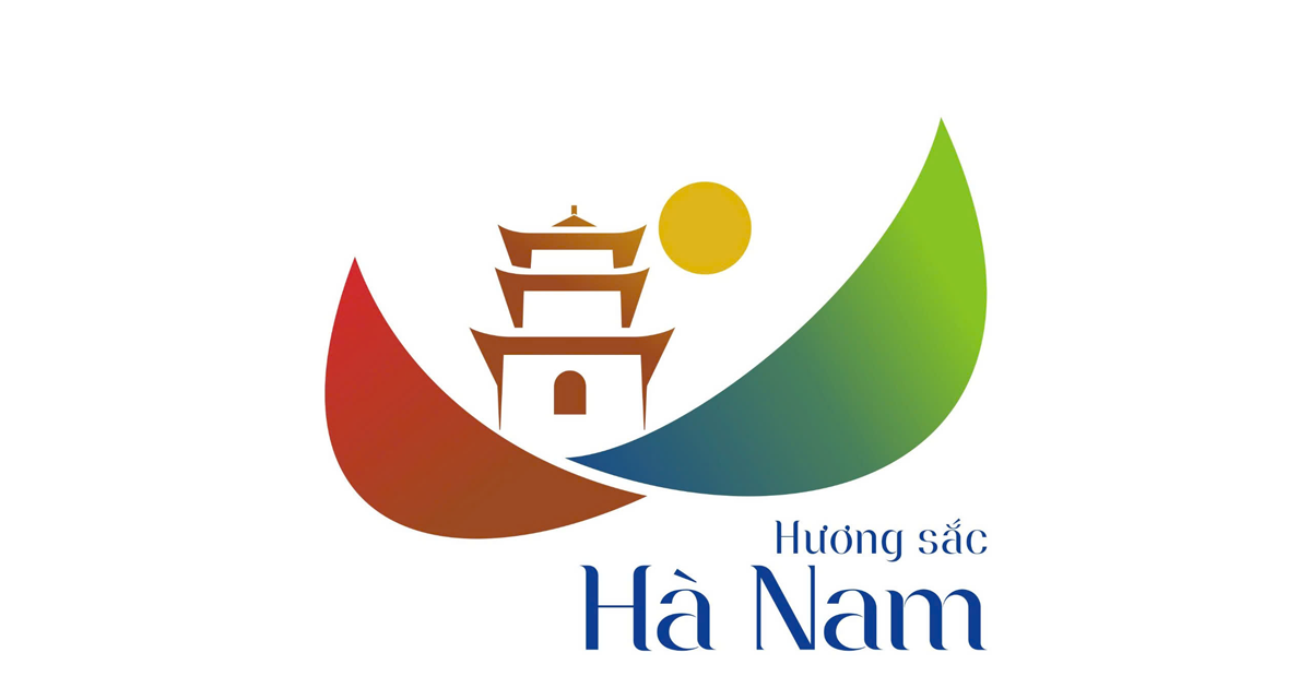
Kinhtedothi - The new tourism logo of Ha Nam province is a combination of the images of a kite, Ngoc - Tam Chuc Pagoda, and the sun, to represent the province's key tourism products, associated with the slogan "Fragrance and beauty of Ha Nam".
On November 26, the Department of Culture, Sports and Tourism of Ha Nam officially announced the province's tourism logo.
After 5 months of launching and organizing the contest to design and create a logo and slogan for the tourism industry of Ha Nam province, the first prize winning work of author Dao Anh Tai (Da Nang) was selected. The logo is a combination of images: kite, Ngoc - Tam Chuc pagoda, sun, to represent the key tourism products of Ha Nam province.
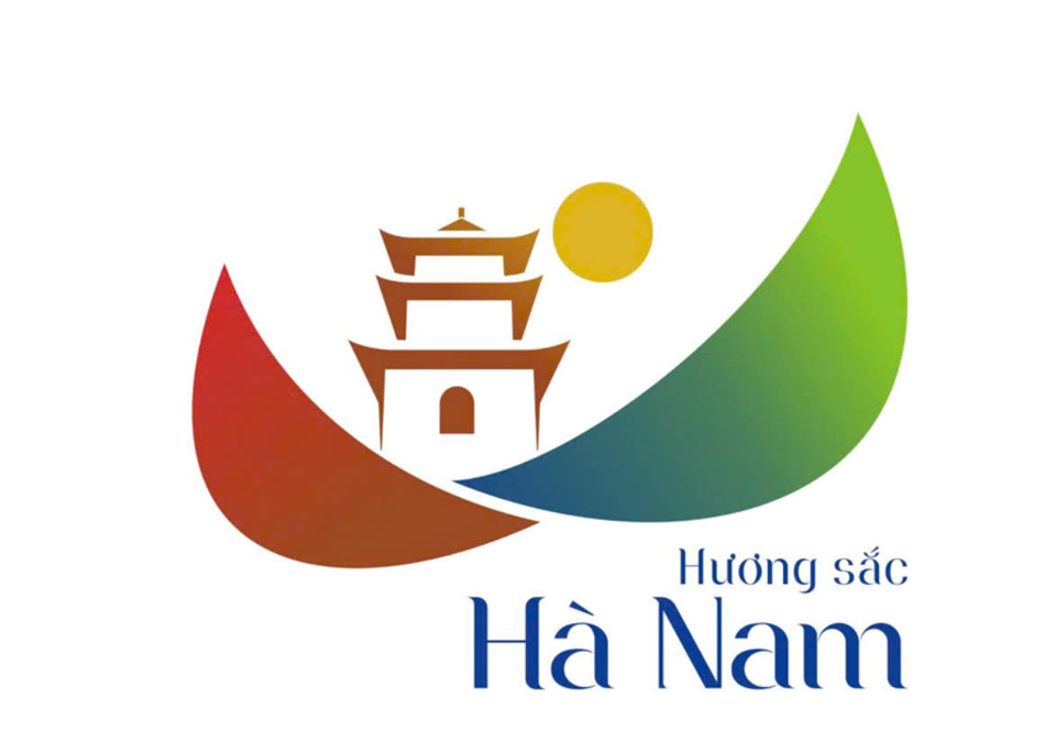
The colors red, yellow and brown represent cultural, historical, spiritual and craft village tourism; the colors blue and green represent eco-tourism.
The center of the logo is the image of Ngoc Pagoda - Tam Chuc national tourist area, representing the strength of cultural, historical and spiritual tourism of Ha Nam.
The image of the sun on top of the pagoda is considered a very poetic image, emphasizing a lyrical Ha Nam, where the soul is calm.
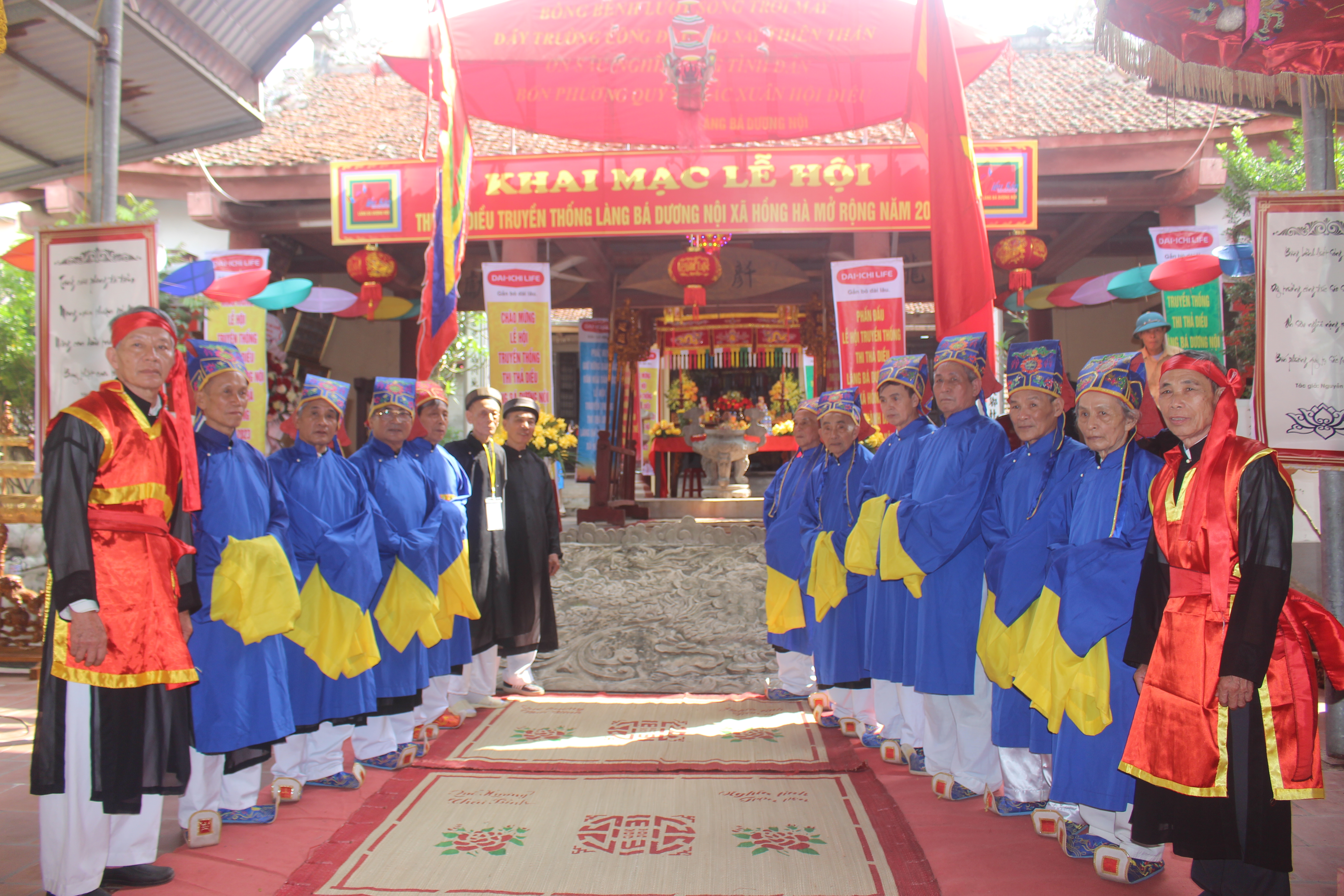
The image of the kite represents the strength of local cultural tourism of the province; is a very typical image for the people of the lowland areas of Ha Nam, is the childhood memory of many generations; is a message about the wings and development of Ha Nam tourism in the coming period.
The First Prize winning logo will be used by Ha Nam province for all information, propaganda and tourism promotion activities; serving political tasks, economic development, culture - society, internal and external affairs in the tourism sector of the province and as the brand identity of Ha Nam tourism.
In 2023, Ha Nam province was honored by the World Travel Awards as "The World's Leading Local Cultural Destination".
Source: https://kinhtedothi.vn/ha-nam-co-logo-du-lich-moi-cua-tinh.html


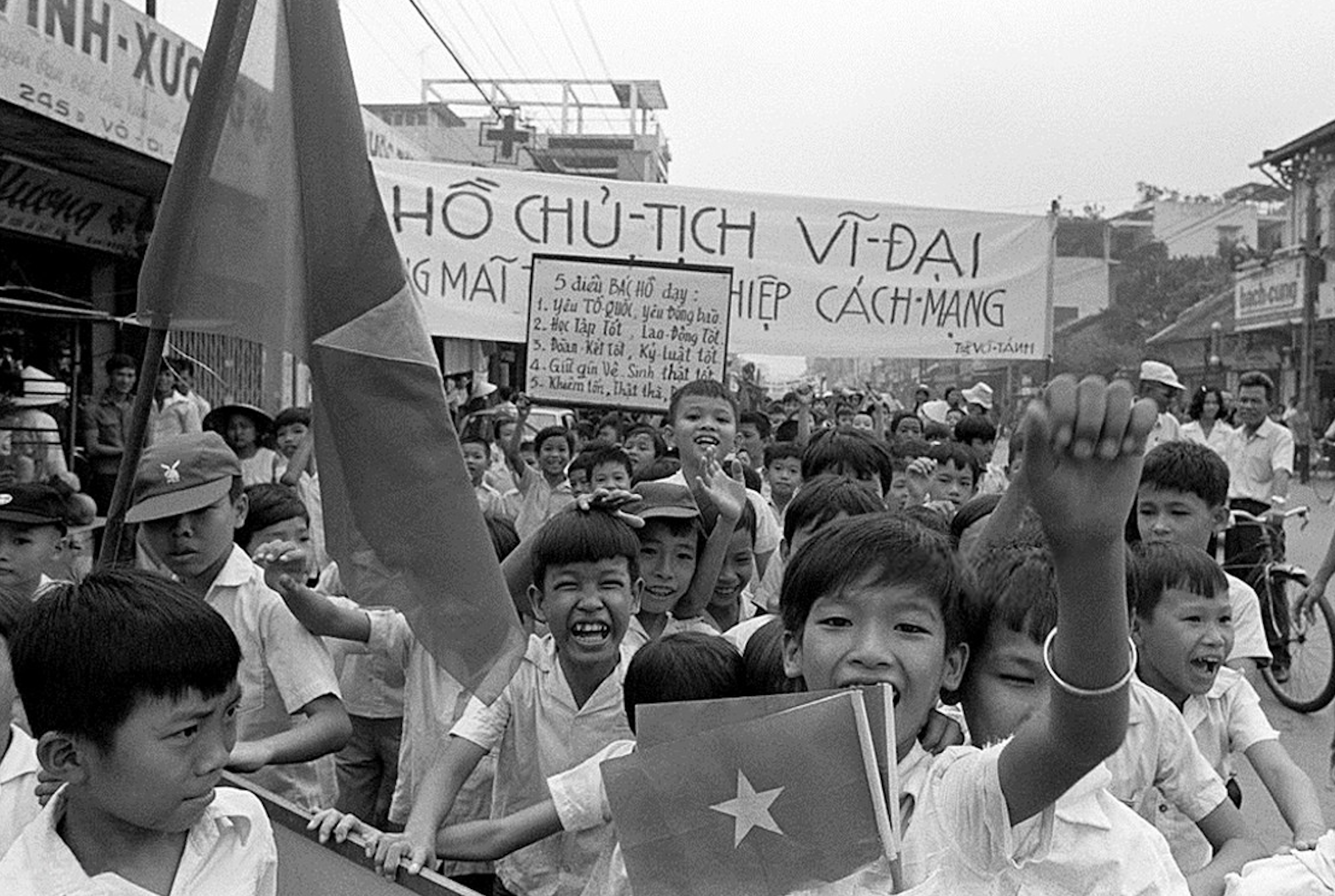
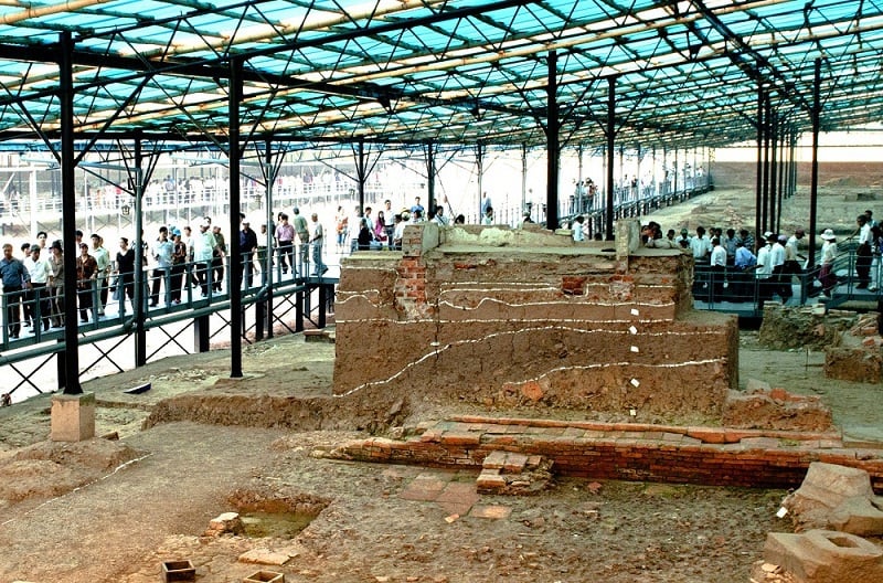
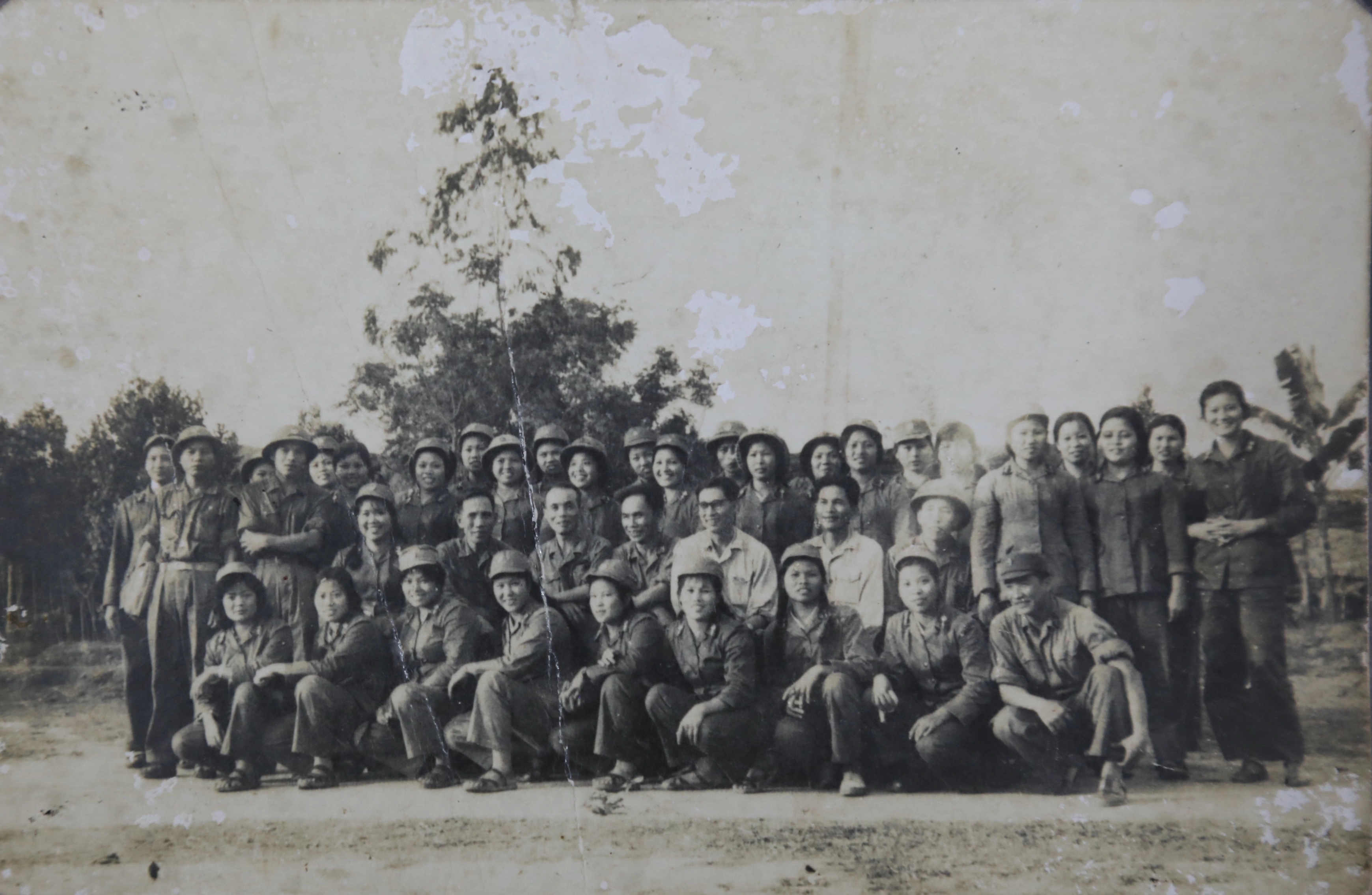
![[Photo] Visiting Cu Chi Tunnels - a heroic underground feat](https://vstatic.vietnam.vn/vietnam/resource/IMAGE/2025/4/8/06cb489403514b878768dd7262daba0b)


Comment (0)