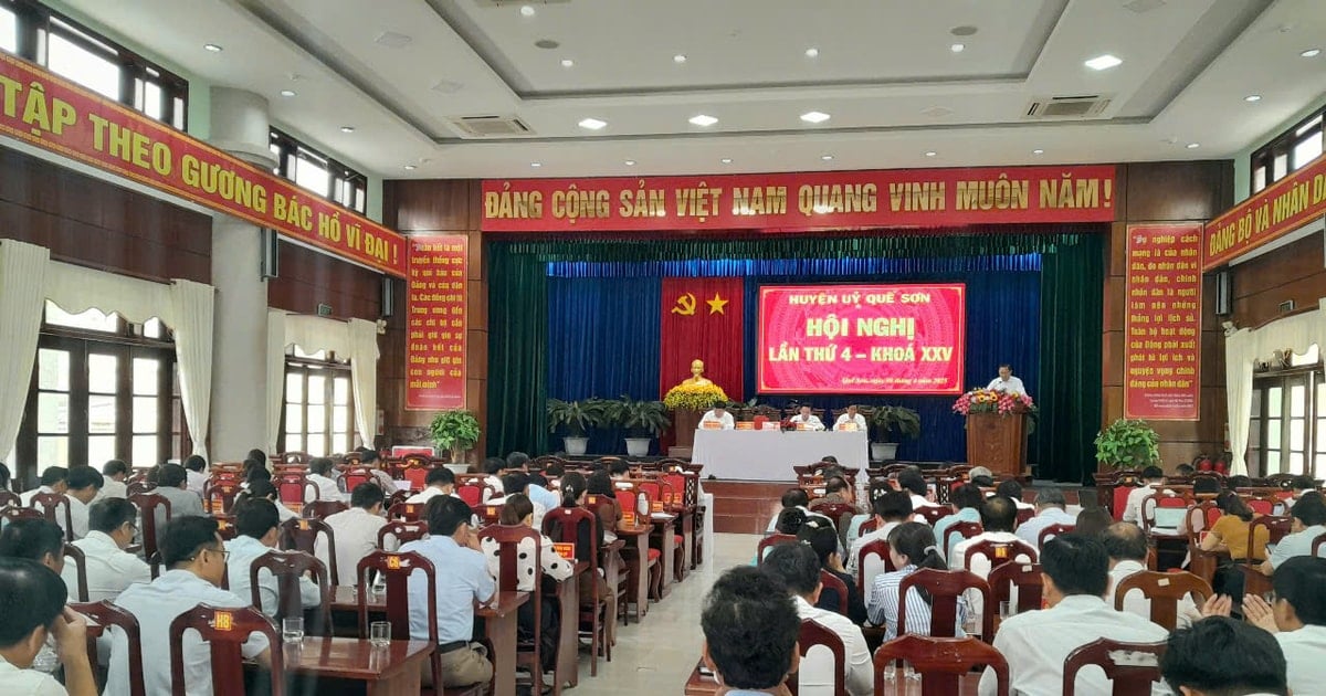
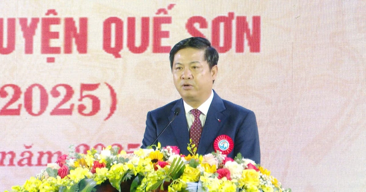
The People's Committee of Que Son district assigned the Department of Culture and Information to directly advise on management and guide the use of the logo for the purpose of propaganda and promotion of the image of Que Son district at political events, cultural, social, foreign affairs, cooperation activities... not for business purposes.
The regulations on management and use of logos issued by the District People's Committee specifically stipulate the use of logos in printing, engraving, pasting on publications, objects and visual forms: Posters, banners, propaganda billboards, conference decorations; forms of use and non-use of the Que Son district logo.
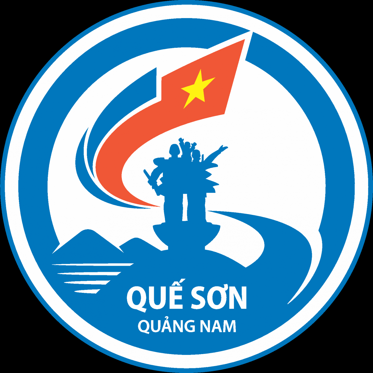
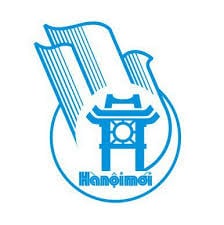
The logo of Que Son district is owned by the District People's Committee and is granted a Certificate of copyright and ownership registration by the Copyright Office (Ministry of Culture, Sports and Tourism).
The logo is designed in a circular layout, with the image of the Que Son Victory Monument in the middle, evoking the heroic memories of the army and people of Que Son district in the past. The Hon Tau mountain range, the system of rivers, lakes, waterfalls and wild nature create a majestic landscape in Que Son.
The stylized logo blends into the Q - S letter structure, creating a harmonious image, with strong characteristics of Que Son. Embracing the monument is the letter S shaped in a spiral development trend, representing strong development, reaching out to create a bright, rich Que Son, integrating and developing with the country in the digital age...
Source: https://baoquangnam.vn/dua-vao-su-dung-bieu-trung-huyen-que-son-3143515.html
![[Photo] Unique folk games at Chuong Village Festival](https://vstatic.vietnam.vn/vietnam/resource/IMAGE/2025/4/10/cff805a06fdd443b9474c017f98075a4)
![[Photo] Phuc Tho mulberry season – Sweet fruit from green agriculture](https://vstatic.vietnam.vn/vietnam/resource/IMAGE/2025/4/10/1710a51d63c84a5a92de1b9b4caaf3e5)
![[Photo] Prime Minister Pham Minh Chinh chairs meeting to discuss tax solutions for Vietnam's import and export goods](https://vstatic.vietnam.vn/vietnam/resource/IMAGE/2025/4/10/19b9ed81ca2940b79fb8a0b9ccef539a)


Comment (0)