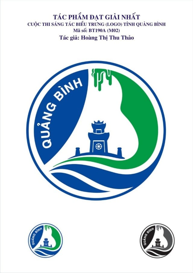
To commemorate the 420th anniversary of the name Quang Binh (1604-2024), the 75th anniversary of the Quang Binh Uprising (1949-2024), and the 35th anniversary of the re-establishment of Quang Binh province (1989-2024), the province organized a logo design competition to define the brand identity of Quang Binh province, with requirements for entries to have a unique, modern composition, colors, and imagery.

The first prize of this competition, selected by the art council, is the logo with code BT190A (M02).
According to the assessment, the overall design of the logo, coded BT190A, is a stylized representation of the two letters Q and B (Quang Binh). The letter Q is shaped into a curved line, symbolizing the Gianh River. The image of the Gianh River, abundant and majestic, reflects the spirit and strength of the people of this region. Since ancient times, the Gianh River has carefully deposited alluvial soil to enrich Quang Binh, creating fertile fields and prosperous villages, contributing to the province's continuous development.
The letter B is designed to represent the majestic mountain ranges and caves symbolizing Phong Nha Ke Bang National Park, also known as "Southern Vietnam's First Cave." The sound of the letter B, combined with the stalactites and stalagmites, creates the magnificent and breathtaking beauty of Son Doong Cave, the world's largest cave and a globally outstanding asset. For the past 20 years and in this new journey, Quang Binh province has cherished and preserved these exceptional values for the goal of sustainable development.
Quang Binh Gate is a centuries-old historical site of immense value in terms of both history and military art. It is a distinctive cultural symbol of this land of outstanding people and rich history. Quang Binh Gate has been classified as a National Monument. Today, it has become a popular tourist destination due to its centuries-old history and unforgettable stories of the indomitable spirit of our army and people.
The logo of the UNESCO World Heritage Committee is placed in the center to send a message to domestic and international tourists that Phong Nha - Ke Bang, recognized as a World Natural Heritage site, is a source of pride for the people of Quang Binh.
The dominant colors are blue and green. Blue represents the vast sky and ocean, symbolizing the aspiration for global integration and development. Green signifies Quang Binh province with its diverse natural ecosystem, sustainable tourism development linked to local culture, and the unique character of the destination.
The Quang Binh Provincial Emblem Design Contest attracted a large number of participants from both within and outside the country, with 445 entries from 200 authors. After several rounds of judging, the three winning entries (first, second, and third prizes) adhered to the contest rules and were in line with the opinions of officials, Party members, and the people of the province. The entries showcased the unique characteristics of Quang Binh province. The Organizing Committee highly appreciated the responsibility and respect shown by the judging panel in selecting the winners, as well as the opinions of officials, Party members, and the people.
Source: https://toquoc.vn/lua-chon-bieu-trung-tinh-quang-binh-20240525193709906.htm


![[Photo] Voting for the 14th Central Committee of the Communist Party](/_next/image?url=https%3A%2F%2Fvphoto.vietnam.vn%2Fthumb%2F1200x675%2Fvietnam%2Fresource%2FIMAGE%2F2026%2F01%2F22%2F1769082445591_chi-9961-jpg.webp&w=3840&q=75)

![[Image] The 14th Party Congress implements the content on personnel work.](/_next/image?url=https%3A%2F%2Fvphoto.vietnam.vn%2Fthumb%2F1200x675%2Fvietnam%2Fresource%2FIMAGE%2F2026%2F01%2F22%2F1769088146286_ndo_br_1-6165-jpg.webp&w=3840&q=75)


Comment (0)