
The new interface represents an open, modern, scientific , and friendly design trend that allows displaying many press products on a new technology platform, meeting readers' diverse and increasing need for information access.
The interface uses standard fonts, similar to prestigious political newspapers in the world, with large, clear fonts. The main color is blue on a white background, making it easy for viewers to read, easy to see, and easy to find information.
Banking Times launches new electronic newspaper interface.
Regarding the content layout, the New News section is placed on the right side of the interface so that readers can easily select the latest information. The Coverage and Focus areas can be flexible in introducing readers to attractive content about prominent political and economic events, and in-depth analysis of finance and banking.
Modern values are also reflected in the expansion of multimedia areas including: photos, videos, e-magazines, infographics, megastories... into information blocks to create highlights.
In addition, the Text to Speech feature or Podcast section helps change traditional newspaper reading habits. With just a smartphone/tablet, readers can listen to articles anytime and anywhere (on the bus, taxi, coffee shop, airport waiting room…).
The new interface is designed in a responsive format to help the newspaper page display compatiblely on all browser sizes, on different devices (computer screens, laptops, phones, tablets, etc.). With an automatic recognition mechanism, it allows setting up display interfaces for different types of computer devices and other smart devices.
Source


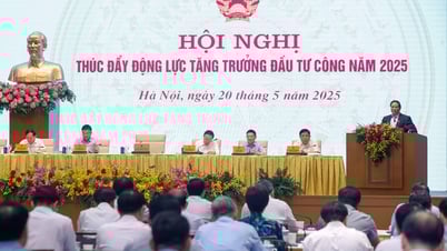
![[Photo] Prime Minister Pham Minh Chinh chairs conference to promote public investment growth momentum](https://vphoto.vietnam.vn/thumb/1200x675/vietnam/resource/IMAGE/2025/5/20/7d1fac1aef9d4002a09ee8fa7e0fc5c5)


Comment (0)