

The intersection of continuous development and sustainable connection with profound core values creates a brand icon
Aiming at customers to open up creativity, the VPS logo is inspired by the image of a prosperous future, the common destination of customers and VPS on the journey together.
The VPS logo structure is a combination of two geometric elements, square and circle, stylized delicately and meticulously to create a shape that simulates "spreading waves". The square and circle symbol conveys the balanced aspects of the brand: people and technology, flexibility and stability, connectivity and sustainable comprehensive development. These are aspects that always go together and cannot be separated.

VPS brand logo
From the image of "spreading waves" - a symbol of continuous development and inspiration from the Mobius strip - representing continuity and sustainable development; the VPS logo symbol clearly depicts the dynamic spirit, easy to access and always moving to develop of VPS.
Solid from within to build trust with each customer
The highlight of VPS's new brand identity is the main color palette with a vibrant purple color that is extremely familiar to investors, demonstrating the trust, commitment to creating the best results and a sustainable future-oriented mindset that VPS has always steadfastly pursued throughout its journey of building and developing over the past nearly 20 years.

Brand colors
The color change also clearly affirms VPS's role as a "trusted companion" of customers, together opening up exciting experiences to welcome a prosperous future.
Along with purple, VPS uses black in the font to show the steadfastness and strength from deep within the organization. VPS believes that sustainable development from within will create a solid foundation for VPS to always have a strong support and momentum to move forward, conquering new steps on its development journey.
The two main colors purple and black leave a strong visual impression, while clearly expressing a contemporary spirit close to the currents of society (contemporary), bringing enthusiastic energy, full of vitality (vivid), towards prosperity and continuous development (prosperous), sustainable with profound core values (sustainable) that VPS wishes to convey.
Open up a dynamic and exciting investment experience with VPS
In addition to the elements of symbols and colors, VPS also focuses on combining the balance between modern, flexible and simple elements through the use of the sans serif font "Forma DJR Display". The lines in the font are streamlined, angular but still soft, which helps create a youthful, lively and friendly appearance, which is also the orientation in the new development stage of VPS "opening up a dynamic and exciting investment experience for everyone".
With a simple, seamless lowercase writing style that fits customers' habits, the letter design makes the VPS brand name easy to remember and creates a strong impression in the minds of customers. The convenience and ease are not only in the writing style but also in the convenience and ease for anyone to proactively approach investing and create a prosperous financial future with VPS.
Always inspired by customers, revolving around the core philosophy of "customer-centric", VPS has completely changed its appearance to join the new generation of investors in "opening an exciting experience to welcome a prosperous future - Inspiring a prosperous future".
The overall logo is a perfectly balanced combination to create a VPS with a completely new look, while once again affirming the brand value of VPS that has been shaped in the Vietnamese financial market.
Source: https://thanhnien.vn/kham-pha-cam-hung-tao-nen-nhan-den-thuong-hieu-vps-moi-185241225113654295.htm
![[Photo] Chairman of the Hungarian Parliament visits President Ho Chi Minh's Mausoleum](https://vphoto.vietnam.vn/thumb/1200x675/vietnam/resource/IMAGE/2025/10/20/1760941009023_ndo_br_hungary-jpg.webp)
![[Photo] National Assembly Chairman Tran Thanh Man holds talks with Hungarian National Assembly Chairman Kover Laszlo](https://vphoto.vietnam.vn/thumb/1200x675/vietnam/resource/IMAGE/2025/10/20/1760952711347_ndo_br_bnd-1603-jpg.webp)
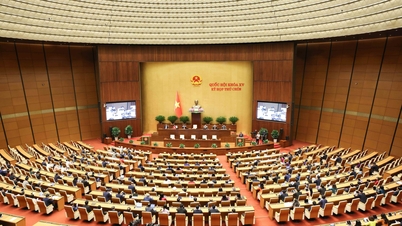
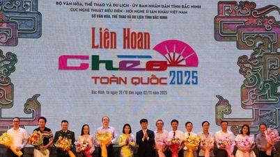
![[Photo] Solemn opening of the 10th Session, 15th National Assembly](https://vphoto.vietnam.vn/thumb/1200x675/vietnam/resource/IMAGE/2025/10/20/1760937111622_ndo_br_1-202-jpg.webp)
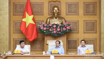
![[Photo] Prime Minister Pham Minh Chinh meets with Speaker of the Hungarian National Assembly Kover Laszlo](https://vphoto.vietnam.vn/thumb/1200x675/vietnam/resource/IMAGE/2025/10/20/1760970413415_dsc-8111-jpg.webp)


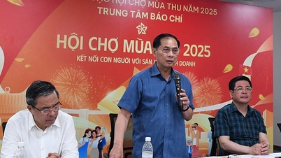
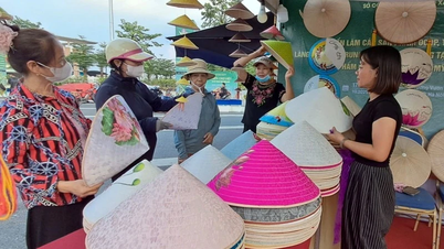
![[Photo] The Steering Committee of the 2025 Fall Fair checks the progress of the organization](https://vphoto.vietnam.vn/thumb/1200x675/vietnam/resource/IMAGE/2025/10/20/1760918203241_nam-5371-jpg.webp)


Comment (0)