
 |
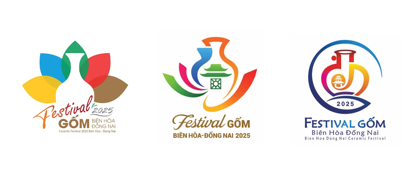
| From left to right: First prize winning design by Pham Thanh Sinh (residing in Tan Mai ward, Bien Hoa city); Second prize winning design by Hoang Xuan Hieu (residing in Dong Ba ward, Phu Xuan district, Hue city); Third prize winning design by Nguyen Van Ngát (residing in ward 3, district 11, Ho Chi Minh city). Photo: Organizing Committee |
Creative imprints from award-winning works
Surpassing more than 120 works to win first prize in the Bien Hoa - Dong Nai Ceramic Festival 2025 Logo and Brand Identity Design Contest, author Pham Thanh Sinh (residing in Tan Mai ward, Bien Hoa city) said that the logo he entered is a harmonious combination of traditional values and modern creativity. The central image of the logo - a stylized ceramic vase is a symbol that condenses the quintessence of Bien Hoa ceramics. The five colorful petals symbolize the five elements, expressing the connection between humans and nature, between art and life. The logo is a vivid symbol of a craft that is gradually reaching international level.
“Every detail from color to font is carefully crafted to convey the spirit of Bien Hoa pottery. The word “Festival” has a modern style, while the word “Pottery” is stylized with a distinctive color, creating a highlight for brand recognition. The minimalist design makes the logo easy to remember and easy to apply on many media platforms. The logo not only represents the event, but is also the pride of Bien Hoa pottery on the cultural map of Vietnam and the world ” - author Pham Thanh Sinh shared.
The second prize winning work of the Bien Hoa - Dong Nai Ceramic Festival 2025 Logo and Brand Identity Design Contest comes from Dong Ba Ward, Phu Xuan District, Hue City by author Hoang Xuan Hieu. The logo was designed to honor the cultural, artistic and traditional ceramic values of Bien Hoa - Dong Nai. The theme "Quintessence of the Ceramic Land" is clearly expressed through the image of a stylized lotus flower and a traditional ceramic vase, carrying a profound meaning of creativity and the crystallization of a long-standing culture.
According to the logo description by author Hoang Xuan Hieu, the image of a blooming lotus flower, spreading its fragrance, symbolizes the brilliant development and constant spread of the pottery profession. On the body of the vase, the Tran Bien Temple of Literature motif is prominently depicted, symbolizing the value of knowledge, creativity, culture and identity of Dong Nai land. The shining star represents the meaning of enlightenment, reaching out and affirming the position of Bien Hoa pottery on the cultural map of Vietnam and the world.
With the third prize winning logo, author Nguyen Van Ngát (living in Ward 3, District 11, Ho Chi Minh City) used rich colors, expressing youthfulness, dynamism, modern design, can be applied on all materials. The uniqueness of the logo is the use of hieroglyphic art to create the letters GBHĐ.N (abbreviation of Bien Hoa - Dong Nai ceramic letters) closely linked together to form a traditional flower vase, one of the main typical products of the locality, with tourism orientation.
After nearly 8 months of launching (from July 2024 to present), the Organizing Committee of the Bien Hoa - Dong Nai Ceramic Festival 2025 Logo and Brand Identity Design Contest has received 128 entries from authors inside and outside the province. The jury has selected the 5 best entries to award on April 30.
Spreading the brand - awakening heritage pride
According to author Pham Thanh Sinh, when he learned that he won the first prize in the Bien Hoa - Dong Nai Ceramic Festival Logo Design Contest, he felt very happy and honored and had high expectations for the next journey of the work. He hopes that the logo will not only stop at a contest, but will actually be widely used in communication, promotion and event organization activities.
“The ceramic logo is not only an identity image, but also a bridge to help Bien Hoa ceramics spread more strongly, closer to the public, tourists and international friends. I believe that, when applied properly and consistently, the logo will contribute to elevating the Bien Hoa ceramic brand, becoming a long-term cultural symbol of this land,” said Mr. Sinh.
The Bien Hoa - Dong Nai Ceramic Festival 2025 logo is not only a symbol to identify the event, but also a "messenger" to spread unique cultural values to the domestic and international community. With a harmonious design between traditional and modern elements, the logos have brought many experiences to viewers, contributing to elevating the Bien Hoa ceramic brand - a famous ceramic line with a long history, sophistication and unique identity.
Every detail in the logo tells the story of the talented hands, intelligence and soul of the potter, thereby creating an emotional connection, evoking pride and spreading love for Vietnamese pottery. This is not only a representative image of a festival, but also a symbol of a living, sustainable and ever-growing heritage.
Ly Na
Source: https://baodongnai.com.vn/van-hoa/202504/doc-dao-logo-nhan-dien-thuong-hieu-gom-bien-hoa-dong-nai-d16024e/
![[Photo] Readers line up to visit the photo exhibition and receive a special publication commemorating the 135th birthday of President Ho Chi Minh at Nhan Dan Newspaper](https://vphoto.vietnam.vn/thumb/1200x675/vietnam/resource/IMAGE/2025/5/17/85b3197fc6bd43e6a9ee4db15101005b)

![[Photo] More than 17,000 candidates participate in the 2025 SPT Competency Assessment Test of Hanoi National University of Education](https://vphoto.vietnam.vn/thumb/1200x675/vietnam/resource/IMAGE/2025/5/17/e538d9a1636c407cbb211b314e6303fd)
![[Photo] Prime Minister Pham Minh Chinh chairs meeting on science and technology development](https://vphoto.vietnam.vn/thumb/1200x675/vietnam/resource/IMAGE/2025/5/17/ae80dd74c384439789b12013c738a045)


![[Photo] Nearly 3,000 students moved by stories about soldiers](https://vphoto.vietnam.vn/thumb/1200x675/vietnam/resource/IMAGE/2025/5/17/21da57c8241e42438b423eaa37215e0e)


Comment (0)