
ZEBRA TIGER - NATIVE MASCOT OF SAIGON
This logo is a black ink drawing, with many details, in which the most prominent image is two striped tigers in a strong and graceful posture, "guarding" a shield in the middle. The tiger image is the native mascot of Saigon, a place famous for its fierce tigers - "kings of the jungle" during the pioneering period.
Ancient history books recorded the Can Gio tiger and Hoc Mon tiger as the most famous and ferocious. Today, tigers are still popular images on stone screens in the courtyards of temples in Saigon and the South.
Meanwhile, at the top of the shield is a sawtooth circle, European style, symbolizing the city. In the shield is the image of a 19th century merchant ship, with two large masts with flags and a chimney in the middle, gliding on the waves. Perhaps the merchant ship and the water both symbolize trade and the position of a city open to the world .

Saigon logo on the city's tourist map before 1945
PHOTO: AUTHOR'S DOCUMENTS

Saigon logo shows circle on metal
PHOTO: AUTHOR'S DOCUMENTS
On the other hand, above the merchant ship, on the right hand side, there is a large five-pointed star, representing the Morning Star, guiding the ship. Perhaps the author implied that this city always looks towards the future, synonymous with modern civilization. The image of the citadel, the sailboat and the river , along with the arrangement, seems similar to the logo of Paris (born in the 14th century, completed in 1853). Could it be that the designer and the City Council at that time wished that Saigon would be the Paris of the East? Later, many French and foreign tourists also had the same comment when visiting the city.
On the background of the logo are some tropical leaves, most clearly banana leaves, very Vietnamese. At the foot of the shield and the two tigers is a silk strip, with the Latin inscription: PAULATIM CRESCAM, meaning "Slowly growing". Indeed, reality shows that the second half of the 19th century was the period when modern Saigon gradually took shape. And then in the first half of the 20th century, Saigon quickly grew, becoming a modern and complete city, catching up and standing shoulder to shoulder with Singapore, Penang, Hong Kong and many prosperous ports in the East Asia region.
In the early 1930s, when the French government promoted Indochina abroad to attract more tourists and investors, the Ville de Saigon logo appeared widely in many books, newspapers, and documents in many languages.

Paris city logo
PHOTO: AUTHOR'S DOCUMENTS

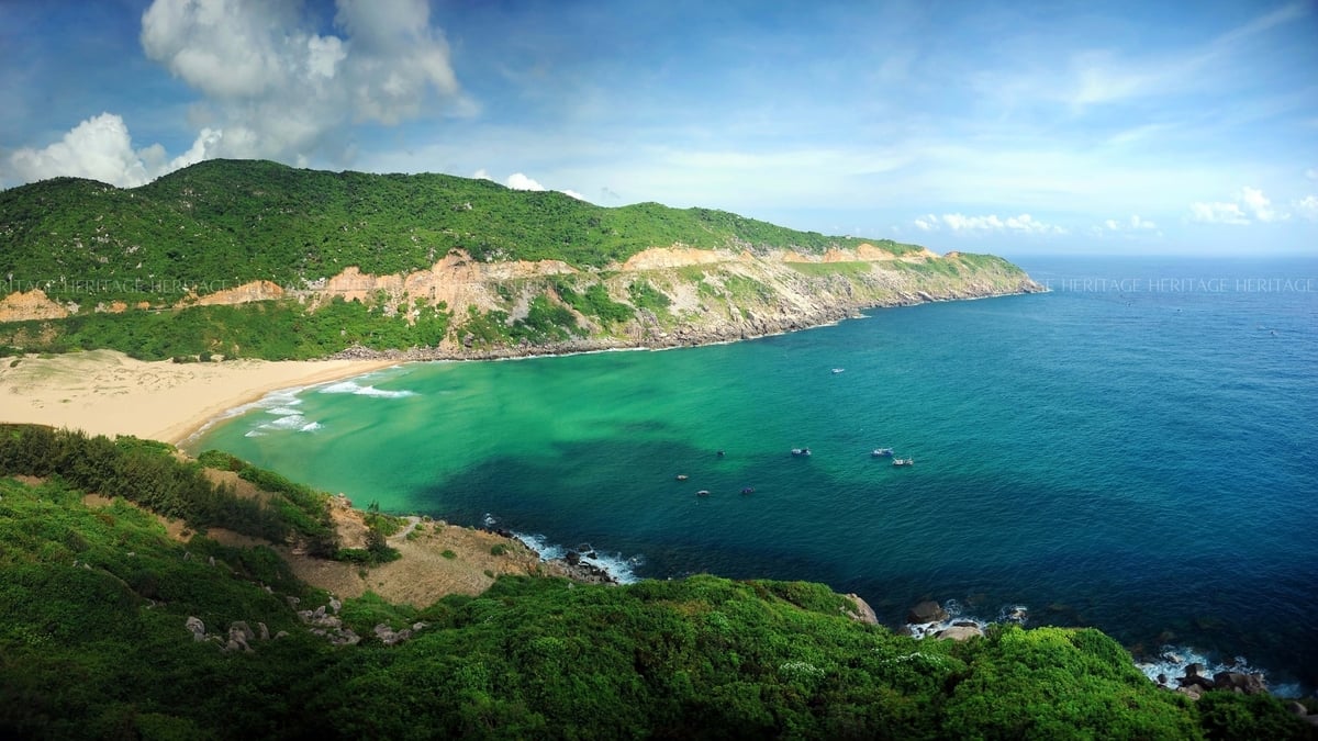
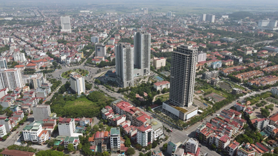
Saigon - Ho Chi Minh City from above
PHOTO: GIAN THANH SON
In particular, in 1942, at the International Fair - Exhibition of Indochina (held in Tao Dan Park), the logo of Saigon city was included in the commemorative medals made of bronze-brown metal. Thereby, the artist arranged the logo in a circle and slightly modified the shape of the citadel and the merchant ship. Notably, the detail of the two French flags was omitted (at this time, the Japanese army occupied Indochina, the French colonial government was forced to advocate for strengthening the role of the Vietnamese).
Until now, it is still unclear who created the logo of old Saigon. It is only known that this logo existed until 1949 - 1950 on the documents of the city hall. After that, the city administration was transferred to the Vietnamese, under the Bao Dai government, so this logo may no longer be used. However, in the following decades, large reliefs depicting the logo of French-era Saigon were still visible inside the interior of the City Hall (the headquarters of the Ho Chi Minh City People's Committee today) and the facade of Saigon Hospital on Le Loi Street. After 1975, these reliefs were no longer seen in these places.
Looking back at the symbol of old Saigon, we can see that it includes elements: history, spirituality, geographical and economic characteristics, and also a development motto.
Source: https://thanhnien.vn/bieu-trung-sai-gon-dau-tien-185250419205126776.htm
![[Photo] Prime Minister Pham Minh Chinh chairs meeting on science and technology development](https://vphoto.vietnam.vn/thumb/1200x675/vietnam/resource/IMAGE/2025/5/17/ae80dd74c384439789b12013c738a045)

![[Photo] More than 17,000 candidates participate in the 2025 SPT Competency Assessment Test of Hanoi National University of Education](https://vphoto.vietnam.vn/thumb/1200x675/vietnam/resource/IMAGE/2025/5/17/e538d9a1636c407cbb211b314e6303fd)
![[Photo] Readers line up to visit the photo exhibition and receive a special publication commemorating the 135th birthday of President Ho Chi Minh at Nhan Dan Newspaper](https://vphoto.vietnam.vn/thumb/1200x675/vietnam/resource/IMAGE/2025/5/17/85b3197fc6bd43e6a9ee4db15101005b)


![[Photo] Nearly 3,000 students moved by stories about soldiers](https://vphoto.vietnam.vn/thumb/1200x675/vietnam/resource/IMAGE/2025/5/17/21da57c8241e42438b423eaa37215e0e)


Comment (0)